Most business owners know slow loading kills conversions, but that’s just the tip of the iceberg. There are a few more design mistakes that hurt your customer base every single day. Don’t worry, small fixes can improve how customers interact with your site.
In this article, you’ll learn about:
- Mobile design fails that frustrate most of your visitors
- Navigation mistakes that make people give up in seconds
- Speed issues are killing the entire customer journey before it starts
- Simple fixes to improve customer experience and boost conversions
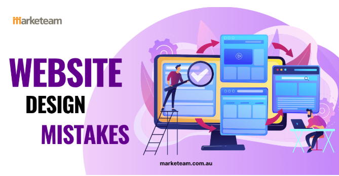
The reality is that poor design decisions cost most companies thousands in lost revenue each month. Let’s be honest here, unless you want competitors capturing customers you’re pushing away, keep reading. This guide by Marketeam reveals what’s breaking your site and how to fix it. We’ll start with the most common culprit: mobile-friendly design problems.
1. Mobile-Friendly Design Isn’t Optional Anymore for Good Customer Experience
94.9% of Australian internet users browse on their phones, yet many websites still treat mobile as an afterthought. It’s undeniable after reading this stat that mobile devices have become the primary way customers access your site. When your pages don’t work properly on phones, you’re pushing most visitors straight to your competitors.
Tiny Text and Buttons Frustrate Users
Tiny text under 16px makes people squint and pinch their screens just to read basic information. Drawing from our experience building Brisbane websites, we’ve seen conversion rates drop by 40% when tap targets are too small.
Buttons smaller than 44px? They’re a nightmare for thumbs. Users end up clicking the wrong thing, getting frustrated, and abandoning their cart. Well, nobody wants to fight with a website to complete a simple action.
Horizontal Scrolling Breaks the Experience
Ever land on a page and have to scroll sideways? It feels broken immediately. Fixed-width elements that spill off the screen create a messy, unprofessional look that screams “this site wasn’t built for mobile.”
Google actually penalises sites with horizontal scrolling in mobile search rankings. Your mobile site needs to flow naturally on every screen size without forcing users to work around poor design choices.
Desktop-Only Features Leave Mobile Users Behind
Hover menus might look slick on desktop, but they’re completely useless on touchscreens. Mobile app lovers can’t hover, so they miss important navigation entirely.
Pop-ups designed for big screens take over tiny phone displays with no visible way to close them. And that’s where things get interesting. Forms that ignore mobile keyboards make filling out basic fields ten times harder than they need to be.
2. Cluttered Layouts Overwhelm Your Visitors
Clean layouts make decisions easier for visitors and boost conversions. That’s the power of simplicity.
Cramming your homepage with every service, testimonial, and call-to-action creates visual chaos. Customers don’t know where to look first, so they leave. It’s like walking into a messy store where products are everywhere with no order.
Believe it or not, white space isn’t wasted space. It guides eyes naturally and helps people understand your message faster. White space gives your content room to breathe and improves customer experience big time (makes it user-friendly).
Here’s what happens with dense layouts. They tire people out before they finish reading. When visitors feel exhausted just looking at your site, they won’t stick around. And yes, we’ve all seen those homepage disasters with 47 different buttons fighting for attention.
What’s more, cluttered designs look unprofessional to potential customers. Your brand loses trust when your business looks messy online. Clean layouts improve usability and show you care about quality.
3. Slow Loading Speeds Kill Customer Journeys Before They Start
Your website has 3 seconds to load before half your visitors give up and click back. You might be wondering how much damage slow loading really causes to customer journeys.
53% of mobile users abandon sites that take longer than 3 seconds to load. Every extra second of load time drops conversions by 7% on average. That means a site that loads in 5 seconds loses nearly 14% of potential customers compared to one that loads in 3 seconds.
Pretty rough numbers, right?
The impact goes beyond just losing customers. Speed directly affects customer experience and where you show up in search results. Google gives fast pages better rankings and pushes slow ones way down the list.
Common Speed Killers
| Problem | Impact on Load Time |
| Unoptimised images over 1MB | Adds 2-5 seconds |
| Too many plugins/scripts | Adds 1-3 seconds |
| Poor hosting infrastructure | Adds 2-4 seconds |
Spoiler alert: your hosting plays a bigger role than most people realise. Fast sites feel more trustworthy to users making purchasing decisions. When customers have a bad customer experience with slow pages, they remember it. They won’t come back, and they’ll tell others about the terrible wait times.
So loading data quickly isn’t optional anymore. It’s required if you want to keep people on your site long enough to actually read what you offer.
4. Confusing Menus Make People Give Up
If visitors can’t find what they need in 2 clicks, they leave for a competitor who makes navigation easier. So what’s the real deal here? Bad navigation directly affects how long customers stay on your site and whether they buy from you.
Here’s what kills usability fast:
- Mega menus with 50+ options: When users see too many choices, they freeze up and often click nothing at all. It’s like staring at a restaurant menu with 200 items. Decision paralysis is real.
- Creative menu names like “Solutions” or “Offerings”: People expect simple labels like “Services.” Users scan menus looking for familiar words. When your menu uses corporate jargon, customers give up trying to figure out what you actually do. Creative menu names might win design awards, but they don’t win customers.
- Buried service pages: When important info sits three or four clicks deep, most people won’t dig that far. They’ll go to a competitor whose site makes sense right away.
- Inconsistent menu placement: When the menu moves or changes from page to page, it ruins customer experience and frustrates people. According to usability research, users expect the same navigation patterns across all pages of your site. The bottom line is that meeting customer expectations for simple navigation improves usability dramatically.
The lesson is clear: poor navigation not only annoys visitors but also costs you real money in lost sales.
5. Hiding Your Contact Details Creates Distrust
Ever land on a site and not find a phone number anywhere? That’s the fastest way to make customers suspicious of your business.
Burying contact info in footer fine print makes your business seem dodgy to Australian customers. People want to know they can reach you if something goes wrong. When visitors hunt through pages just to find an email, they wonder if you’re even legitimate.
The thing is, customers expect phone numbers and addresses visible right away. Meeting customer expectations here builds instant trust. Missing contact details trigger red flags, especially for service-based businesses.
The opposite approach works better. Showing your contact information up front signals confidence in your brand. It tells customers you stand behind what you offer. This simple change improves customer satisfaction before anyone picks up the phone.
6. Weak Calls-to-Action Leave Money on the Table
Strong CTAs are the easiest way to turn interested visitors into actual customers. When users land on your site ready to buy, your buttons need to guide them clearly toward that purchasing decision.
Unfortunately, three things kill your CTAs:
Vague Button Text Doesn’t Motivate Action
Generic “Click Here” or “Submit” buttons lack urgency and don’t tell users what they’ll get. Specific phrases like “Get Your Free Quote” convert twice as well as vague text. But if you use action-oriented language, you tell customers exactly what happens when they click that button (and yes, we’ve tested this countless times with real customers).
Poor Colour Contrast Makes CTAs Invisible
Buttons that blend into backgrounds get ignored even by users ready to buy. That’s why high-contrast colours make such a big difference. They draw attention and boost click rates by up to 30%. Following accessibility guidelines also makes your buttons visible to all customers while improving usability across your site.
Too Many Options Paralyse Decision-Making
Multiple competing CTAs split focus and tank conversion rates across your entire site. When customers see five different buttons all screaming for attention, they often click none of them. One primary action per page guides users toward your main goal effectively. Secondary buttons should look less prominent to keep a clear visual hierarchy that makes purchasing decisions simple.
4 More Mistakes That Quietly Hurt Your Site
We’ve covered the big ones, but there are a few more design mistakes that people rarely talk about. These might seem small, but they add up fast and push customers away without you even realising it.
- Auto-playing videos and sound: Nothing kills trust faster than a video that blasts sound the moment someone lands on your page. Users scramble to find the mute button or just leave immediately. What’s more, even auto-playing silent videos can slow down your site and distract from your actual message. Give people control over when media plays.
- Outdated copyright dates in the footer: Seeing “© 2019” at the bottom of a site in 2025 makes visitors wonder if you’re still in business. It signals neglect and makes your brand look abandoned. This tiny detail affects trust more than most businesses realise. Update it or remove it entirely.
- Broken images and missing links: Dead links frustrate users who are trying to learn about your services. Broken images create an unprofessional look that screams “we don’t maintain our site.” Regular checks catch these issues before customers do. One broken element makes visitors question what else doesn’t work.
- Ignoring mobile keyboard types: When someone taps an email field on mobile, they should see an email-specific keyboard with the @ symbol easily accessible. Phone number fields should trigger the number pad. These small touches improve customer experience and reduce friction during form completion. Most sites still use generic text inputs for everything.
These smaller mistakes might not seem like deal-breakers on their own, but together they create friction that drives customers straight to your competitors. Fix them now before they cost you another sale.
How to Improve Customer Experience Through Smarter Design Choices
Now that you know what’s breaking your site, here’s how to fix these issues step by step. These practices help improve customer experience without requiring a complete rebuild.
- Test your site on actual mobile devices weekly, not just browser developer tools. Through our practical work with small businesses, we’ve found that testing on real devices catches issues that developer tools miss every time. Particularly because real users interact with your site on phones, that’s where you need to test.
- But wait, there’s more to it. Run Google PageSpeed Insights monthly and fix issues preventing you from hitting an 85+ score. In this way, the process gives you specific data on what slows your site down and how to improve cx.
- Survey 10 customers about navigation clarity before launching any major menu changes or restructures. Well, ask them to find specific information on your site and watch where they struggle. This simple step reveals usability problems you’d never spot on your own.
- Use heat map tools like Hotjar to see exactly where users click and where they ignore completely. The data shows you which parts of your site work and which parts customers skip over. Basically, implement changes based on real behaviour, not guesses.
- A/B test one design element monthly to gather real information on what improves customer experience. For instance, test button colours, headline text, or form layouts. Small changes often make a big difference in how customers interact with your site.
Pro tip: Focus on fixing one issue at a time so you can measure what actually moves the needle for your customers.
Ready to Fix Your Website Design?
Getting a professional website that converts doesn’t need months or a huge budget. Look, these mistakes aren’t just design flaws. They’re profit leaks costing you real customers every single day.
Marketeam builds Brisbane websites that ensure human interaction without these common errors. Our average turnaround time is 4-5 weeks, and you’ll own everything (software, hosting, design, and content). No ongoing fees just to access your own site.
We handle the digital world, SEO, and training so your site actually works for your business. Our service creates a great experience for your customers while boosting customer satisfaction from day one. With our support packages, you get help whenever you need it.
Contact us today for a positive experience and see where your site might be losing customers.